Statsig's Brand Identity
Statsig, founded in late 2020, set out to create an industry-leading A/B testing platform. The company was established by a team of former Facebook engineers, product managers, researchers, and designers. With its quirky, personal, and modern design, Statsig quickly garnered widespread acclaim. However, the company needed a new brand identity to reflect its unique character.
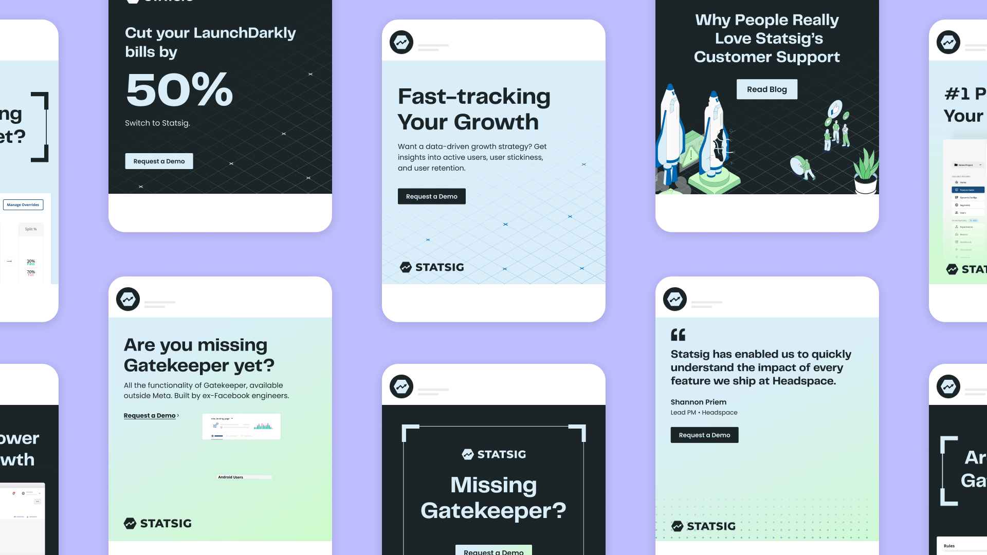
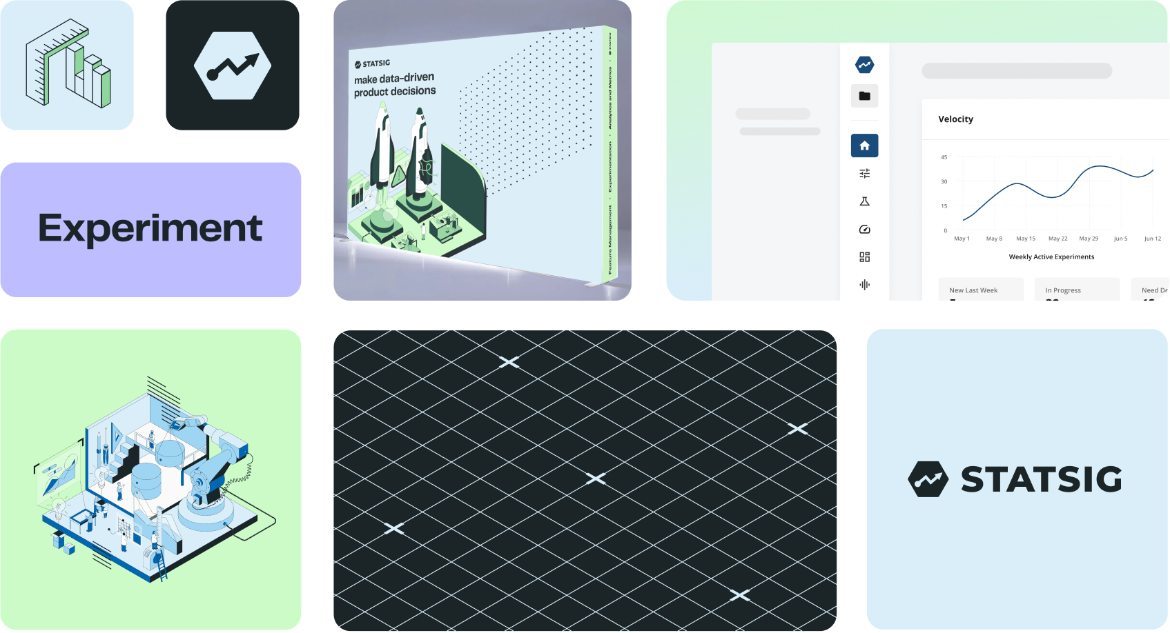
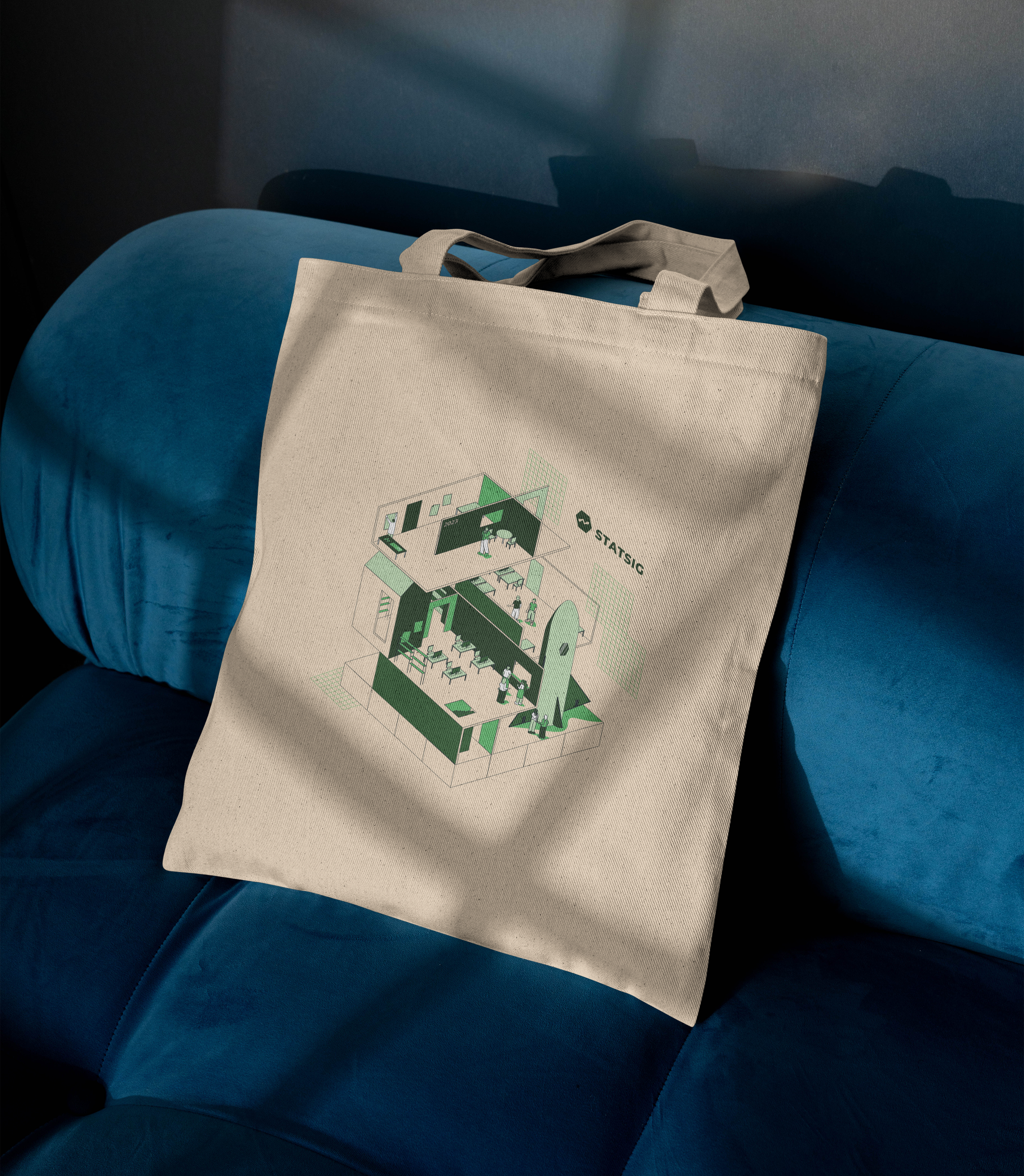
In 2021, I was hired as the first brand designer to begin the development of the brand identity. By early 2022, we successfully launched a new brand identity that embodied the same flexibility, quirkiness, and vibrancy that define our team. The result was a bold, modular identity that aligned with Statsig’s values of speed, experimentation, and accessibility. Want more info? Check out this blog I wrote to introduce the brand!
My role: In-house designer
Team: Cat Lee, Jessie Ong, GB Lee

Statsig's existing visual assets were fragmented, leading to inconsistencies across various platforms. This lack of cohesion posed challenges in user navigation, brand recognition, and overall user experience. The objective was to create a unified design system that would ensure visual consistency across all touchpoints, enhance usability and accessibility for diverse user groups, and facilitate efficient collaboration among cross-functional teams.


Conclusion
This project reinforced the importance of a user-centered approach in brand design. By creating a scalable and cohesive design system, I was able to enhance the user experience and facilitate cross-functional collaboration. This experience has deepened my commitment to integrating UX principles into all aspects of design.
As of March 2024
Statsig has been acquired by OpenAi